
You did it.
You built your form, you sent it out, and you received plenty of responses from the right audience. All that’s left is to review the feedback and to use it in the ways you originally set out to.
But as you comb through it, you can’t help but say, “uh-oh.”
You find that your form has a low completion rate, and for the responses that did come in, few make sense.
Any wufan can experience the scenario above if they aren’t too careful. To give yourself a chance at receiving a high completion rate, and to collect meaningful responses, consider these 3 Wufoo features: required fields, page rules, and field instructions.
Let’s explore each of these features and dig into how you can use them effectively on your next form.
Required fields: Your one-way ticket to golden responses.
Every field is unique. It’s your job as a form creator to recognize the fields that provide you with essential information versus those that don’t, as only the former should be required to fill out.
Say you’re trying to collect online payments from your form.
You mean business when you ask respondents for their full name and credit card information. After all, if they aren’t willing to answer either field, they can’t get what they want, and you can’t get paid. So make these fields required!
If, on the other hand, you also ask respondents (on the same form) how they plan to use your product/service, their responses can be helpful, but aren’t essential. So keep these fields optional!
In short, only require the fields that directly contribute to meeting your form’s goals. Doing so allows your form to not only collect more completions from the questions you value most, but it also gives your respondents a better experience—as they’ll have less fields that they need to fill out.
Proactively developing goals for your forms can help you make each of them more focused and concise. Master the art of goal-building by reading our “Ultimate Guide to Using Wufoo.”
To add required fields on your form, see the steps outlined in our help center article.
Field instructions: Get on the same page as your form takers
Sometimes, what you ask on your form may seem crystal clear to you, but not to your respondents.
For example, if you ask for their “Full name,” there’s a chance that they’ll interpret it as asking for either their first or last name.
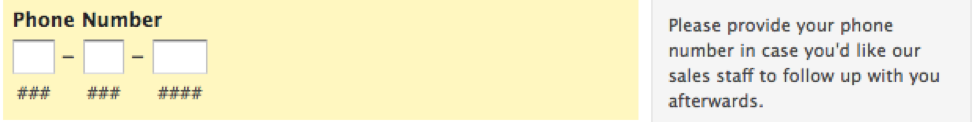
Clarify your ask by using field instructions—which allow you to add context to the right of any field:

Field instructions also work great when you want to explain why you’re asking for certain information.
Say you’re hosting a webinar and decide to use a form to sign people up for it (great idea!). If you add a field that asks respondents for something personal, like their phone number, it may be worth including an explanation on how you plan to use it.
Note: Feel free to add as many field instructions as you’d like. Any one field instruction only appears when the respondent is filling out its corresponding field.
Include field instructions by following these steps.
Page rules: Give your form takers the personal treatment
This feature lets you customize the page respondents see next, based on the answer they provide from a specific field on the current page they’re on.
Page rules gives you a chance to put respondents into different groups, and then ask each group a specific set of questions that allows you to better understand them. Segmenting respondents also allows you to serve each groups’ needs more effectively.
Let’s break down how it works using a pair of examples!
Say you’re collecting employee feedback using a form (another great call!). You want to ask different questions, depending on whether the employee is an individual contributor or a manager. So you add a field that asks the respondent for their title, and you set up page logic for that field. More specifically, those who select “Manager” go on to a page that you want managers to fill out, while those who choose “Individual contributor” go to another page that’s geared towards them.
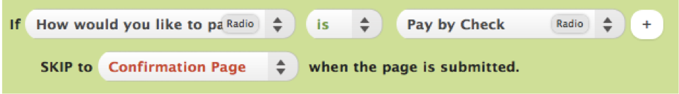
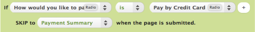
Now imagine that you’re using a form to collect online payments (you’re on a roll!). You ask the respondent how they’d like to pay, with their two choices being by “Check” or via “Credit Card”. Thanks to the rules you’ve set up, they’ll go to the “Payment Summary” page if they select “Credit Card”, and to the “Confirmation Page” if they select “Check”.
There’s a whole lot more to page logic. To get the most out of this feature and to see how you can enable it, visit our help center article.
By using these 3 features, you’ll be able to build forms that are more straightforward to fill out, and relevant to each respondent. The result: more valuable completions for you to work with.
Now, the next time you review your responses, you’ll find yourself saying “a-ha!” instead of “uh-oh.”
Comments
Everyone needs a hug.
Posted February 1st, 2019 by Jon.