
We’ve no problem being blunt. The Running Total is such a beautiful feature of Wufoo. The user can fill out the form and see exactly how much they owe as they fill it out. Everything seems clear and well, perfect–right? What could ever go wrong with such a lovely feature? Not much.
However! It is possible that users may run into one tiny issue. Let’s say you have a longer form with a Running Total, fields next to each other and a long section break in it. When the running total scrolls down with the form, it can get in the way of those other fields.
Check this out:
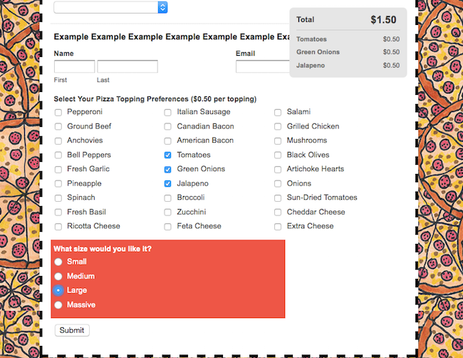
It may not be the prettiest sight you’ve ever seen. Sure, there’s pizza in the background–brightens up anyone’s day of course–but that running total is obscuring the view of some of the fields. The user could scroll back up to see it all again, but it can be a bit of a pain. Luckily, you can use custom CSS to fix that running total to the top of your page so it doesn’t get in the way. It’s proper easy CSS as well:
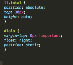
That CSS will tell the running total to stick to the top of the page rather than moving with the form as the user scrolls up and down. As a result, it won’t get in the way of any fields or section breaks in the form. Let’s check out the same form after adding that CSS:
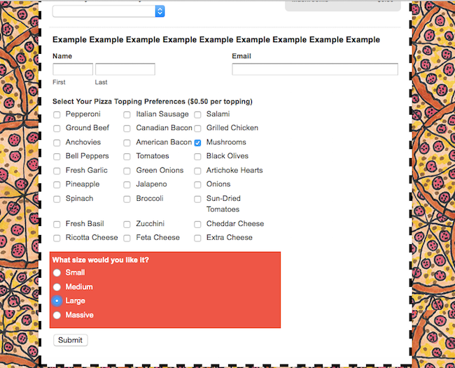
Since the CSS has been applied the running total isn’t budging from the top of the page. Now all fields are clearly visible, but the running total remains in the form. Just another way that some simple CSS can improve your form!
As always, share your burning questions or comments with Kane in the Comments section below!
Comments
Everyone needs a hug.
Posted September 1st, 2015 by Tobias.Is this running total feature available if you’re not using it for actual payment processing? I’ve been needing to know how to do the running total but could not find out how to do that. Can you send me documentation how to set that up? Thanks.
Posted September 1st, 2015 by Juanita Duncan.@juanita you definitely can do that: http://www.wufoo.com/guides/get-a-price-quote-with-wufoo/
Posted September 1st, 2015 by Kane.