
Greetings, fantastic form friends! We know your forms should not only be functional but they should look beautiful too–whether it’s being filled out on a laptop, desktop, or a smartphone. That’s why I want to share three things to keep in mind when designing a form to be mobile-ready. These tips will help you optimize both your field settings and custom theme.
1. Instructions for User text
As you may know, the Instructions for User text will only show to the right of the field when your mouse hovers over it in the live form. This is a great way to give the user guidance about filling out a particular field, when necessary. However, Instructions for User text may not pop up on the right sidebar of the form correctly on certain mobile devices.
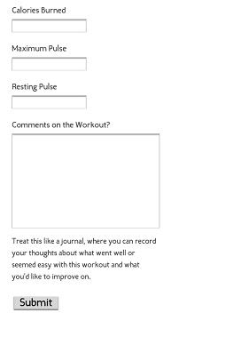
Let’s fix this by using the altInstruct CSS Keyword.
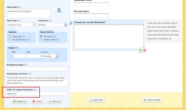
This changes the formatting to make the Instructions to User text appear below the field, rather than as a pop-up– we want to make sure users filling out the form on their phones get those additional instructions.
2. Side by side fields
CSS Keywords allow you to modify other aspects of field layouts as well. One of the more popular uses is to place fields side by side in the form–this gives you more control over the formatting by letting you visually organize certain fields into more distinct categories. Depending on how many side-by-side fields you have, this setting can actually have the opposite effect when viewing the form on mobile devices. Check out how jumbled and messy these fields look in my Exercise Training log on an iPhone. All the fields are still contained within the form width, but it’s not a clean look:
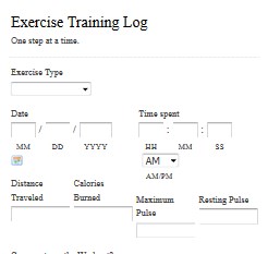
For the most orderly form design on your phone, avoid using the side by side CSS Keywords–leave them for forms primarily viewed from a computer or a device with a larger screen. They’re not necessary to make a phone look great on your phone.
3. Logo size
The default width of a Wufoo form is 640px, but the average width of a mobile phone is much less than that. What does this mean for your form’s custom theme? If you’ve configured the logo to fill the full width of the form, it will get cut off in the live form when viewed on a mobile device. As you can see in the first iteration of my Exercise Training log, only a small portion of the logo image is visible:

First, you’ll need to either choose a smaller image or resize it in an image editing platform like Paint for PCs. When the image is the size you want it, you’ll need to host it publically somewhere on the web. If you don’t already have a file/image hosting account, such as with Dropbox or Google Drive, a go-to/free secure hosting site is httpsimage.com
Once you have uploaded the image to the hosting site, go ahead and grab that URL to use it as your own logo in your theme. But this theme isn’t ready to go just yet–I have one more tip to make this theme completely mobile-ready. In the Background property of the Theme Designer, you can match the header color with the form color. Here you can see I made both the form and header’s background white.

This way, if the logo happens to not take up the full width of your phone’s screen, it won’t look out of place. This looks much better:

And there you have it–hopefully these tips will help alleviate any headaches about how to optimize your forms for mobile. As always, don’t hesitate to reach out to our support team for questions!
Want more on CSS tricks? Check out our series on the blog and take advantage of our Guides page. You can also leave us questions/comments below–we check daily.
Comments
This page is not responsive. Mobile templates or responsive forms are needed. Typeform is responsive without any additional work. I’d like to see this from wufoo.
Posted June 4th, 2015 by Bee.Thanks for these tips, but they feel like a stop-gap solution. What’s on the roadmap to make wufoo forms truly responsive/adaptive for mobile?
Posted June 4th, 2015 by P.+1 to both the comments above. Would be great to hear the plans for mobile/responsive, as it’s definitely limiting how we use wufoo.
Posted June 4th, 2015 by James.Everyone needs a hug.
Posted June 4th, 2015 by Akilah Wimbley.Hard to believe they are not responsive. This is my first time using and couldn’t understand why the forms don’t take up the full screen on iPhone 6, 6+ or even less on Samsung Galaxy S6 and S6 Edge. Pretty disappointed.
Posted June 4th, 2015 by Dean.If your form is embedded you can make a custom css style sheet shown how to here:
http://www.wufoo.com/guides/use-form-anatomy-custom-css/
for mine i added a class called phoneClear and added this to my CSS
@media only screen and (max-width: 460px) {
form li.phoneClear {
clear:both !important;
width:94% !important;
float:left !important;
}
}
and then just have to add phoneClear in my “Add CSS Layout Keywords” on each of the forms i want to collapse to like it normally would when the entire div of the form is less then 460px or whatever you want in to be in the @media call. It helps because i have so many fields I didnt want to have to have them all stacked up on a desktop when I had the room. Hope this is helpful to someone.
Posted June 4th, 2015 by David.Please hollar when your forms become responsive. We’re looking into switching out of wufoo, because the form just doesn’t look great/easy on iphone… Thanks!
Posted June 4th, 2015 by becky.if you want to have a mobile forms, you can create them at Canvas or Snappii
Posted June 4th, 2015 by Jane.I need some help! My form is not showing up at all on mobiles when viewed on a facebook tab https://www.facebook.com/kohtaokids/app_190322544333196
??? Really irritating as I spent money promoting it!
Posted June 4th, 2015 by Claire.So the only options are for the logo to look good on mobile, or look good on a computer, not both? 🙁
Posted June 4th, 2015 by Susie.