
Back again for another installment in our CSS Tips ‘n Tricks how-to series! In the last CSS tutorial we changed the images on our form with the :hover selector, and today we’re going to focus on a few other really simple tricks to make your form look that much nicer using CSS.
First, we’ll go through the Error messages. If your users are filling out your form and they do something wrong like forget to fill out a required field, then we’ll throw them an error that tells them that they’ve run into errors and shows them where those errors are. While it’s not possible to change what the error messages actually say, you can change how they look. If we go back to our lovely form that we’ve been building so far and forget to fill out the required field, we’ll get an error that looks like this:

There’s absolutely nothing wrong with that. It definitely draws attention to the errors that have been made and where they have been made. What if you want to change it around a bit though? Custom CSS would be the way to go. If you inspect the element of that page and view the error messages, you can find the selectors needed.
We’re going to change the Top message so there’s no border and it’s a tad bit smaller. To do that, we’ll see that the top error message uses the ID: “errorLi”, so we’ll need to use #errorLi in the CSS rule. Since I’m a big fan of rounded corners, we’ll also put a rounded corner on the border around the word “highlighted.” That will be done with form li.error. In addition, we’re going to put a border around the highlighted field and change the colour. This will change the colour of the background around “highlighted” as well to keep things consistent. Sounds like a lot, but there’s not much CSS needed.
Here it is:
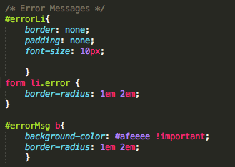
Not too much going on here. We’ve wiped our hands of the border and taken out the padding for good measure. If you notice we’ve also added !important to the background colour of the error message. This is because the original also uses !important and would override our CSS if we didn’t add that in there.
Now, I don’t want a logo in my form, but if I choose not to have one the charcoal header is still there in place. I’d like it to all be the same colour of my background, which is white. Sticking with some simple background-color changes, I can do that by targeting the Logo with #logo a.
![]()
That will just change the background colour of your logo to white. This is also nifty if you have a smaller logo in your form and you want to erase that charcoal background that takes up the rest of the header.
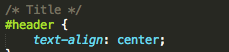
Finally, I want to center the title of my form. It’s all well and good over in the left like it is right now, but I think it would be a bit cooler if it was centered. This is some of the easiest CSS you can use, but centering things makes everything look fantastic. The title will use the ID: “header”, so we’ll want to use #header.
Now let’s have a look at what those changes have done to our form:

Lovely jubbily. We’ve still hit an error for not filling out that field, but that border at the top of the page has been removed, the colors have changed as well as the nice rounding of the borders in the bottom error. There’s no charcoal at the top of the page and the title of the form is centered to make everything look wonderful. This form is really coming along!
For even more CSS know-how, check out Kane’s other blogs and be sure to visit Wufoo’s Guides page.
Comments
The link for “the last CSS tutorial” (top of page) didn’t work for me.
Posted May 9th, 2015 by Karen Druery.